Product Detail Page
View full product information including images, specifications, pricing, downloads, videos, bundles and cross-sell or up-sell items.
Open the product detail page
Click any product name or image on the product catalogue page. The product detail page can also open as a popup dialog when adding products to an order or quote.
A Back to product catalogue link at the top returns you to the catalogue with your previous filters preserved.
Image gallery
The left column shows a vertical thumbnail strip and a main image area.
- Click a thumbnail to view it in the main display.
- If the product has no images, a placeholder is shown.
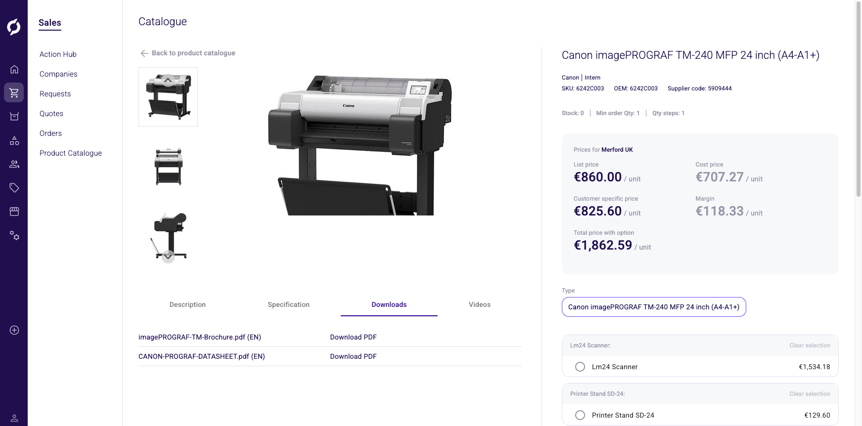
Content tabs
Below the image gallery, four tabs provide additional product information.
Description tab (default)
Displays the product's short description and long description. Both may contain formatted text.
Specification tab
A two-column table of all public product attributes showing the attribute name and its value. Text and enum attributes can have multiple values, each shown on its own line. Attributes without a value for the current language are hidden.
Downloads tab
A list of attached documents. Each entry shows the document description with a language code (for example "Datasheet (EN)") and a clickable download link. If no documents are attached, a message reads "The product has no documents attached."
Videos tab
Displays embedded YouTube or Vimeo videos associated with the product, matched by language. If no videos are attached, a message reads "The product has no videos attached."
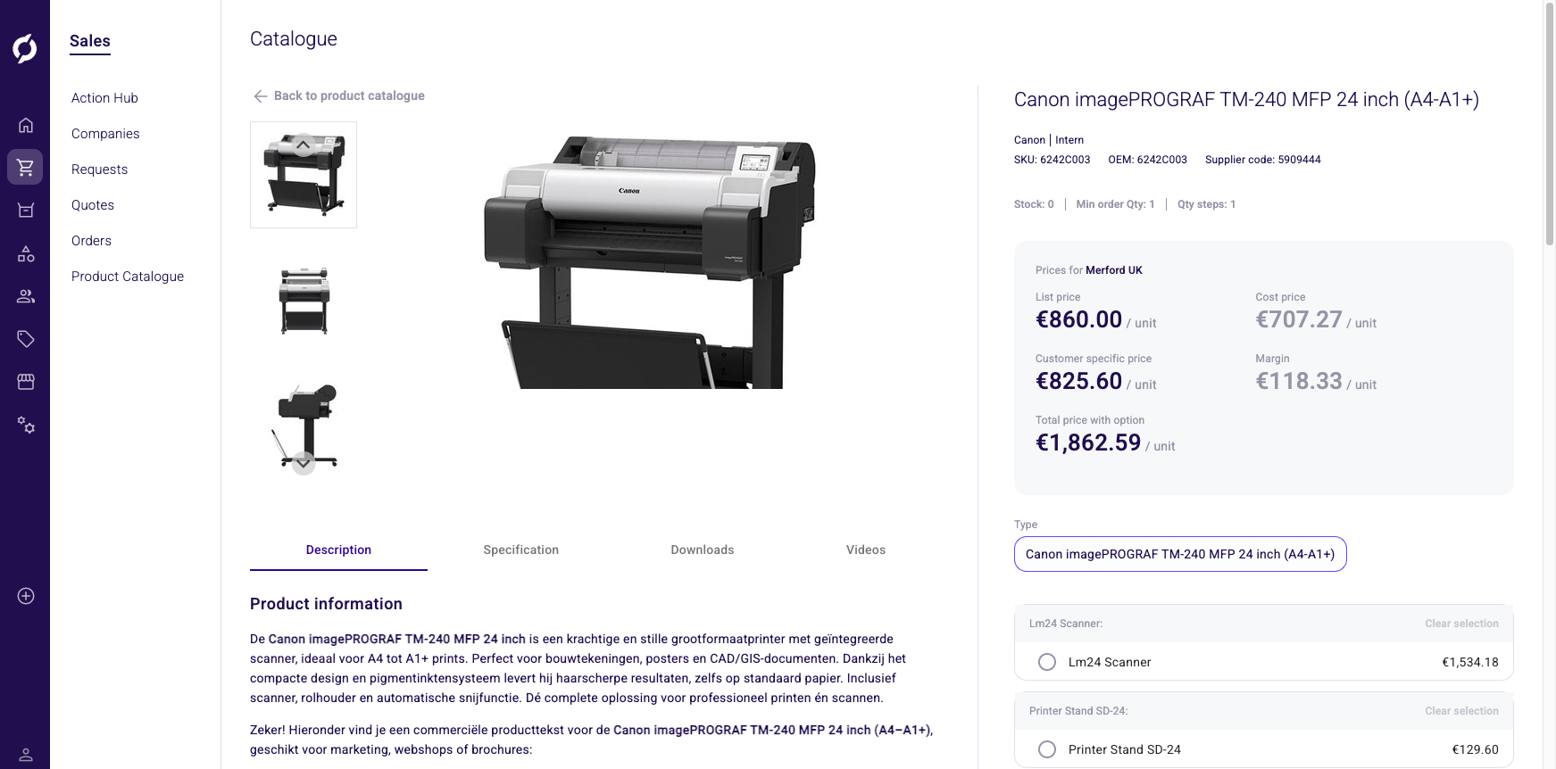
Pricing and stock information
The right column (sticky panel) shows product identity, stock information and pricing.
Product identity
| Element | Description |
|---|---|
| Product name | Large heading |
| Edit link | Links to the PIM product or cluster editor (only shown when opened from an order or quote context) |
| Manufacturer | Manufacturer name (if set) |
| Supplier | Supplier name (if set) |
| SKU | Stock Keeping Unit code |
| OEM | Manufacturer code (if set) |
| Supplier code | Supplier's code (if set) |
Stock and quantity
| Element | Description |
|---|---|
| Stock | Total available inventory quantity |
| Min order Qty | Minimum order quantity |
| Qty steps | Quantity increment per step |
Pricing
The heading shows prices for the selected company and contact, or "Anonymous user" if no user context is selected.
| Price line | When shown | Description |
|---|---|---|
| List price | Always (if available) | Standard list price in EUR |
| Cost price | When pricing visibility is not restricted | Purchase price in EUR |
| Customer specific price | When a company or contact is selected | The price specific to that customer |
| Margin | When pricing visibility is not restricted | Selling price minus cost price |
| Total price with option | Clusters with configurable options only | Sum of base price plus selected option prices |
Each price line shows the unit of measure (package description) next to the amount.
Bulk prices
If the product has volume-based pricing (more than one tier), a collapsible Bulk prices panel shows a table with bulk quantity thresholds and their corresponding unit prices.
Surcharges
If surcharges apply, a collapsible Surcharges panel shows each surcharge name and its amount (either a flat fee in EUR or a percentage).
Explain price
Click the Explain price button to open a dialog that breaks down how the price was calculated, including which price sheets, discounts and rules were applied.
Explain price is also available in the product picker while building a quote or order, so you can check how a price is calculated before adding the product.
Cluster-specific features
When viewing a cluster product, additional selectors appear in the right column.
Attribute selectors
For each configurable attribute (for example Size or Color), a selector is shown. The display type varies:
| Display type | How it looks |
|---|---|
| Radio | Horizontal tiles, click one to select |
| Dropdown | Standard dropdown menu |
| Image | Clickable image tiles |
| Color | Color swatches |
Selecting an option updates the active product variant. Incompatible options based on your previous selections are grayed out or disabled.
Configurable options (add-ons)
If the cluster has optional add-on products, each option group shows the option name (marked with an asterisk if required), radio buttons listing each available product with its name and price and a "Clear selection" link for non-required options.
The Total price with option line updates as you change selections.
Bundles
For non-cluster products, bundles display as a visual equation with product cards separated by "+" signs, followed by "=" and the bundle info showing bundle name, description, original price (struck through), bundle price and savings amount.
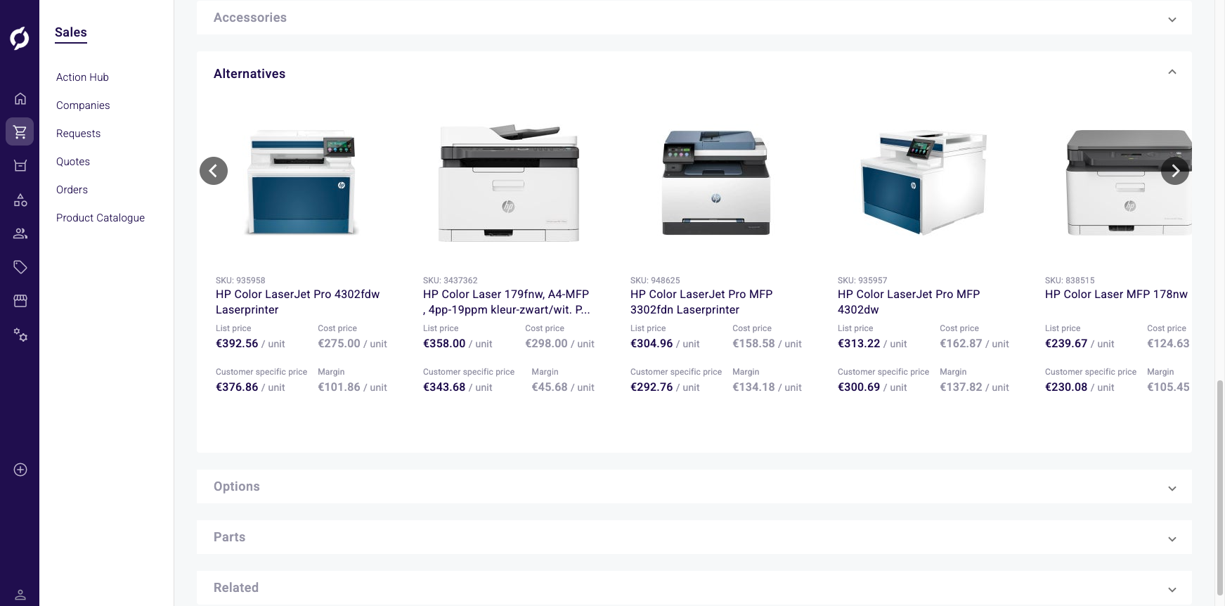
Cross-sell and up-sell
Expandable panels appear for each relationship type that has items:
| Type | Description |
|---|---|
| Accessories | Complementary products |
| Alternatives | Substitute products |
| Options | Optional add-ons |
| Parts | Component parts |
| Related | Related products |
Each panel shows a horizontal carousel of product cards. When opened from an order or quote editor, each card also has an Add to order or Add to quote button.